Does it pay to be quirky? Our judges review different approaches to sharing your research online
Having an accurate and up-to-date group website has become essential in modern research. It’s a way to introduce your work to future students and potential collaborators. But how do you make the most of this important tool? Is a no-nonsense traditional webpage the way forward, or can a wacky original format or a humorous theme help to make the best first impression?
We selected three research group websites of varied styles and asked two judges to give their verdicts. Jason Woolford is a publishing editor at the Royal Society of Chemistry and runs the official Twitter account for the RealTimeChem community project, while Athina Anastasaki is a postdoctoral fellow at the University of California, Santa Barbara, US, and a regular webwriter for the Polymer Chemistry blog.
The professional layout
Anne McNeil, chemist at the University of Michigan, US, chose to go for a very clean and easy to use design. ‘A website is the face of your group to the world,’ she explains. ‘I wanted the website to be streamlined and allow people to get where they want to go… I go to people’s group websites all the time – they publish a paper or visit and I check them out. It’s the first face.’
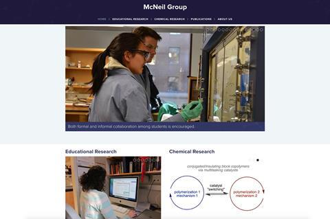
McNeil’s website is focused at introducing herself to colleagues and recruiting postdocs. To make sure any visitors get to the information they want quickly, she’s stripped down the menu on her homepage to only a handful of options. ‘Our approach is to have a top bar with only the three most important things: your research, your publications and your team. I used to have a ton of hyperlinks – now you can go in to menus.’
This pared down approach isn’t just designed for desktops, either, McNeil adds. ‘The website works on mobile. Nothing is more frustrating than having something go off the side of a mobile screen and not being able to read it.’
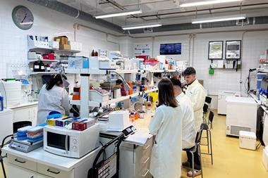
But while the website likes to keep things simple, it still has an injection of McNeil’s personality. Group pictures show team-building exercises with members dressed as Iron Man, and McNeil’s own profile shows her with her two children. ‘We’re pure scientists and we care about what we’re doing,’ she says, ‘but that doesn’t mean we can’t enjoy each other’s company have some fun – that’s something I want to get across. And, as a woman and mum, I always try and have a picture of me and my kids. It sends a message, as a role model to younger women, that you can have this job and still have a family.’
Judges’ comments
Jason Woolford: The website looks great from the off, a straight forward layout, simple interface and is visually welcoming. It gives the impression a modern, professional chemistry group, with the focus being on a group rather than just the lead chemist. Each of the sections is broken down well, containing all the information you’d want to know in a visually pleasing fashion to boot. Publications isn’t just a list, for instance – it actually links into each paper at their source.
The whole site is a great example of what a modern chemistry group website should be; more group websites should be like this.
Athina Anastasaki: Very user friendly. The publications are clearly presented and easy to search. I would like to see more information for each group member, and I do not like the photos that change automatically – I want to choose how much time to spend on each photo on my own.
The personal adventure
A straight-up professional approach isn’t your only option. A group website needs to reflect your personality – and there’s plenty of scope to make a statement. Max Heiman, biologist at Harvard Medical School, US, wasn’t comfortable with the ‘usual’ style of group websites – and wanted to do something different. ‘At first, I resisted putting up a website because I felt it was very self-promotional,’ he says. ‘I wanted something that didn’t bombard any visitor: I want to hear what their interests are, and pick and choose. I also wanted the website to reflect the lab. I don’t usually assign projects or tell people what to do in a directed way, my goal was to create an environment where people can explore and make discoveries as they go.’
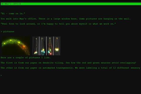
Heiman’s solution was to build his group website as an interactive text adventure, inspired by playing Zork on his father’s Apple II as a child. Visitors have to type in instructions and explore the virtual world of the lab to find out what’s going on. ‘Exploration takes a little initiative, and it’s not for everybody,’ Heiman admits. ‘But once you poke around you find interesting things. If you go in to my virtual office and look out the window, it gives you a weather report. That’s the actual live weather report, it’s not boiler plate. It’s updated every hour!’
Unsurprisingly, Heiman’s unusual approach has received both positive and negative feedback – something he uses to screen potential collaborators and see if they would fit in with his group. ‘When I screened it by the lab, there was a very mixed opinion. Initially, I wanted to force people to figure it out. But I ended up adding a plain website as an escape hatch.’
Despite this concession, Heiman feels that his website is an accurate reflection of what he does. ‘It’s a funny feeling, hitting on the right combination of words – which is how I feel about doing science. It’s the right combination of actions that elicits the right result.’
Judges’ comments
Jason Woolford: Quirky. The website doesn’t open on your traditional welcome page, but rather a classic 1980s text adventure. I played with the microscopes and ended up inside a worm! You can talk to your lab mates and learn more about the laboratory, its occupants and the science that’s going on. It’s random, but ultimately rather charming and tells you something about the group leader right off the bat. That being said, it’s probably baffling to anyone who just wants to contact you or isn’t familiar with 1980s computing. For non-English visitors, or just someone wanting to get right to the point, it’s an interface that is difficult to penetrate.
Athina Anastasaki: My first impression was ‘what is going on?’, followed by ‘this person is a genius!’… and then ‘I’m bored’. I think most of the younger visitors of the website will find it a good idea and like it. But some of them – and certainly many of the more elderly academics – will not get the concept or be able to extract any information out of it. Although I very much liked the idea, it makes you feel tired and bored very quickly and it is very time consuming to type what you want to find. There is also no information on the principal investigator: I would like to see his CV and know his previous experience.
Key points
Whatever style of website you create to promote your group, here’s a few key tips:
- Focus on layout and make sure the website is easy to navigate and intuitive to its user; make sure you include basics such as your university, contact details and areas of interest
- Websites are visual, so make sure you have stellar images, videos or diagrams that give context to your work
- Most web browsing is done on mobile phones, so check that your site still works on the small screen
- Think about your audience. Who do you want to look at the site? Is it a way to network or do you want to use it for recruitment?
- Group websites don’t have to be purely professional. Have fun and make sure it reflects your personality
The fantasy realm
You don’t need to have the skills to design and code a 1980s style adventure game to make a research website your own. Johan Elf, a biological physicist at Uppsala University, Sweden, decided to make the most of his unique surname, creating a Lord of the rings-inspired webpage. ‘I have a read a bunch of Tolkien books in the past, and I thought this theme was fun,’ explains Elf. ‘Making a theme related to something specific to the group felt natural.’
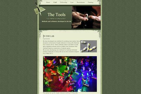
After finding a suitable website template online and adding in options such as ‘craft’ and ‘lore’ in place of more commonly used ‘research’ and ‘publications’ tabs, the Elf Lab webpage was born.
The unusual site attracts a lot of attention, and Elf says that the vast majority of feedback he receives is positive. ‘When I give presentations or go to meetings and people try to find something more about me, they end up at the website and they think it’s fun, I guess. They usually tell me that.’
Under the website’s ‘fellowship’ tab, group members are each given fantasy-inspired roles: postdocs have been dubbed with such monikers as ‘The Wizard of Light and Matter’ and ‘The Ranger of Intracellular Entropy’, while the group’s secretary is given the title ‘Dungeon Keeper’. Elf explains that candidates seeking to join the group often suggest their own mystical titles. ‘I had a position of project coordinator at some point, and I got someone working in the Swedish Tolkien Society or something like that [who] applied just because of the website.’ Sadly, though, Elf says that few people actually refer to him as the Lore Master in real life.
Judges’ comments
Jason Woolford: I see what you did there. The Elf Lab brings certain ideas into mind straight away, you’re either going to go with Lord of the Rings or Santa’s Grotto and you know the latter will annoy people for 364 days of the year. The website’s visual trappings have an abundance of charm and wit, but it does feel a little old fashioned. It’s quite a basic website underneath the theme, but remains perfectly functional for its purposes of highlighting the group and their work.
I’d say the ‘craft’ area has some brilliant visuals, including moving gifs that showcase the work well. The front page is a long blog-type post that combines news with overall highlights and a research overview. You have to scroll down the page a bit to find the more detailed news. It feels like it needs a proper welcome page stating the research aims of the group alone, the rest of the information could then be divided into the other sections of the website.
Athina Anastasaki: My first thoughts were that this is an interesting concept and design. However, it is very hard to navigate and takes a while browsing to find what you want. I liked the ‘tools’ section which is very informative about their research, but I could not find the name of the university anywhere. It took a while to discover that you can click on the photos of each lab member as there is no sign that these images would direct you to a new page. This makes finding information about the principal investigator and the lab members challenging.


No comments yet