
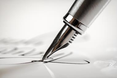
Professional lettering with a few rubs of a ballpoint pen
Writing a thesis is never fun. I remember it as a hard, boring slog – a time brought back to me by a couple of students who are now reaching the end of their PhDs. They are now in the final battle to find the words to explain what they’ve done and express what they’ve learned. When I sympathised, one of them added ‘and don’t get me started on the diagrams…’
I bit my tongue thinking about the fact that until about 20–30 years ago many science departments employed a draughtsman/photographer to prepare diagrams, graphs and slides. Today, the job is long forgotten as drawing and plotting software like Inkscape or R makes it possible for everyone to produce their own images.
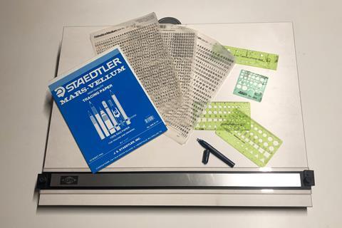
But in the past, the drawing board was a tool to be mastered to prepare one’s thesis. I have one of these, tucked away in a corner of my office, a flat board with a series of tensioned wires at the back designed to keep a movable ruler parallel to the bottom edge. Generations of students drew their diagrams on sheets of paper clamped firmly to the board using a set of long-nibbed rOtring technical pens filled with jet black ink. Chemical structures were drawn using plastic stencils – aligned using the ruler. For graphs and spectra, a sheet of drafting vellum could be overlaid onto the output of plotters, or hand-drawn graphs, and the data carefully traced onto the clear sheet, complete with axes and scales. The one problem that remained were the text labels – stencils might do the job, but the result was typically rather amateurish. All of this was transformed by an invention that emerged from the daydream of a Welsh printer, ‘Dai’ Davies, while commuting by train to his employer’s workshops in Soho, central London, in 1956.
Beyond cut and paste
In an age when signage and flyers required the laborious task of transferring a design either onto metal blocks or a masked ‘silk’ screen for printing, Davies wondered whether there might be a simpler method that would allow a graphic designer to generate printer-ready lettering without the fiddly business of drawing shapes, cutting them out, and then pasting them into position. Davies thought of ‘decalcomanias’, the drawings that are given to children. Such decals – that have been around since the 19th century – are attached to a backing sheet, loosened in water, and then stuck to the skin where they form instant tattoos. Could something similar be created to place individual letters on a page?
Arriving at the printworks, Davies had a chat with company’s tech guru, Frederick Wilson Mackenzie, whose workspace upstairs was full of seemingly broken printing and photography supplies and paraphernalia. Mackenzie was a compulsive tinkerer, not just repairing but constantly tweaking and improving the firm’s equipment. It is not known what background ideas he dipped into, but several ‘adhesive transfers’ already existed. Whatever his inspiration, a couple of weeks later, Mackenzie returned to Davies’ office with a letter attached to some plastic. After wetting it, Mackenzie applied it to a silkscreen and then turned it over and pressed it to a sheet of paper on Davies’ desk.
Enormously excited, the pair approached one of their directors, James Shand, who agreed to provide a few thousand pounds and a defunct subsidiary to develop their ideas. But development was slow and after a couple of years the company’s patience ran out. Davies scrambled to find another backer.
Dry transfer would make typography much more accessible
Through all this, Mackenzie was still tinkering and by 1959 had come up with a dry method. The idea was to print ‘indicia’ (letters or, as the patent suggested, musical notes) onto a transfer sheet made of flexible but inelastic polyethylene. The ink used – carbon black dispersed in castor or linseed oil with a phthalate or naphthenate plasticiser – needed to adhere to the plastic and form a fairly strong, yet pliable, film. The ink would then be overlaid with a pressure-sensitive adhesive – a water-based acrylate co-polymer with very low ‘tack’ so as not to pick up dust. To apply the indicia, the sheet would be placed adhesive-side down and the letter rubbed with a ballpoint pen to deposit the letter onto the receiver surface below. Dots and lines were printed onto the carrier to make it easier to place letters with precision. Suddenly Davies’ dream of ‘freeing the letters from the page’ had come true.
The dry transfer would make typography much more accessible, introducing neophytes to the subtleties of alignment and kerning. Davies’ and Mackenzie’s company Letraset developed numerous of its own typefaces, clip art, myriad ‘action transfers’ for kids, and sheets with standard component symbols that transformed technical drawing. In spite of sometimes shambolic management, Letraset became a multi-million pound company that stayed independent until the arrival of desktop graphic design and publishing software. As my friend Michael de Podesta, a keen user of Letraset in younger days put it: ‘Even when a technology becomes essentially obsolete, the objects which previously embodied its perfection remain … perfect!’
Acknowledgments
I am hugely indebted to Tom Vinelott of action-transfers.com for his insights and memories.


No comments yet