Is there art in chemical structures and diagrams? Jennifer Newton looks at the aesthetics all around us
Do chemists and artists have more in common than we think? After all, art and chemistry both seek to manipulate matter. Chemists have always used their imaginations to tie the microscopic world to the macroscopic one and master the combining and breaking apart of the invisible entities we now call atoms.
Beautiful scientific concepts are often accompanied with diagrams and models to illustrate the concepts that words cannot do justice to. ‘Getting chemistry across, by the use of diagrams and structural models, does involve you trying to make something that is pleasing to the eye,’ says David Knight, emeritus professor of the history and philosophy of science at Durham University, UK.
Arguably beautiful and artistic in their own right, the aesthetically pleasing nature of diagrams, illustrations and models is often an afterthought to the theories they explain. We might be taught that science should not express itself in the individual and emotional way that art does, and it must remain objective. But is this a realistic picture of how science has evolved?
Pushing the boundaries
‘John Dalton’s 19th century depictions of atoms are particularly compelling,’ says Tami Spector, an organic chemist at the University of San Francisco, US, who also studies aesthetics in chemistry. ‘They have this beautiful quality to them and are incredibly imaginative. So I think they’re very akin to art.’
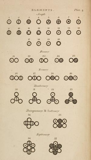
Dalton’s atomic hypothesis was a convincing explanation for the widely held notion that compounds are made from a combination of precise and reproducible proportions of their constituent elements. Although the atomic theory of matter had already been around for a couple of centuries, the originality of his work lay in how he organised the expanses of chemical data in the literature to render it intelligible. He illustrated his atomic theory with circular symbols for each of the known elements, and hypothetical clusters of these symbols to represent molecules.
Drawing those images was a very radical thing to do – it was almost heretical to draw images of atoms at the time. ‘Like an artist, Dalton was sort of pushing the boundaries. I don’t think he was thinking about it that way – he was using them to think through a particular problem but it came out looking abstractly artistic,’ explains Spector.
Dalton’s atomic drawings weren’t appreciated at the time but in retrospect we view them as artistic artefacts of chemistry – they have been carried forward in 20th and 21st century textbooks as emblematic of the science from that time, and of Dalton’s particular contribution to the chemistry of compounds. At the time, people objected to him conceptualising atoms like that. ‘Only in retrospect do we actually view them as aesthetic, which is interesting,’ adds Spector.
Fanciful imaginings

‘I like the 19th century scientific images of atoms and molecules that are unfettered by our more “realistic” notions of atoms and subatomic particles’ says Spector. ‘Because 19th century scientists didn’t have specific accepted images of atoms and molecules, or even necessarily an acceptance of the idea of atoms in the modern sense, it allowed them to be more fanciful in their imaginings of chemical processes and as a result more whimsical and abstract.’
Spector points to Edward Youmans’ Chemical atlas as one example of a collection of these curious images. Originally published in 1854, the illustrated textbook states at its beginning that it was ‘designed for the use of students and pupils in all schools where chemistry is taught’. It is sadly long out of print, but available in the public domain on the internet. Its introduction discusses the superiority of the eye over all other senses and its undeniable value in education: illustrations become indispensable and human nature means we cannot help but want to grasp chemical reality with our eyes. Youmans developed unique graphical representations of elements and their behaviour in compounds, and the illustrations are accompanied by explanatory essays, discussing how the illustrations were conceived.
The atlas was a pioneering publication in the use of colour to convey quantitative information. Individual atoms are represented by different colours in the hand-finished plates, resulting in a striking and effective display of information. Youmans explained that, in his textbook, he chose to colour oxygen red because it changes the colour of blood to bright red, and nitrogen blue because it makes up around 80% of the sky. These, along with many of the other elemental colourings used in the book, have been carried through to systems in use today, including a popular colour convention for distinguishing atoms of different chemical elements in the CPK models developed by and named after Robert Corey, Linus Pauling and Walter Koltun.
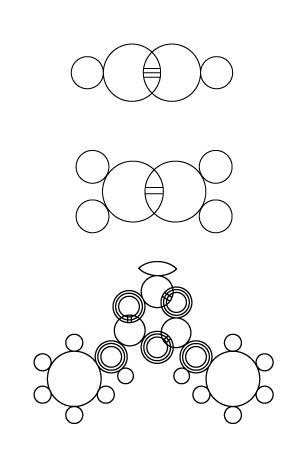
Spector says that Josef Loschmidt’s molecular representations were also incredibly original for their time. Born in 1821, Loschmidt was a chemist/physicst who is often forgotten, as most students learn that August Kekulé predicted the ringed structure of benzene. ‘All this about dreaming on London buses and snakes biting their tales, no one knows if it was true or a good story, but once someone had the elegant idea to leave out all of the single and double bonds and just draw a hexagon, the formulae started to look a good deal simpler,’ says Knight. Kekulé’s dreams are certainly a good story, but it is now generally accepted that he was at least aware of the fundamental insights and depictions of cyclic organic molecules made by Loschmidt in his Chemische Studien of 1861.
Seven foldout plates depict 368 structures, 121 of which are aromatic compounds. These portrayals seemed so bizarre to his contemporaries that they ignored his privately printed work – but compare these drawings to the molecular modelling pictures around today and they bear a remarkable resemblance. Loschmidt’s depictions of ethylene and acetylene, with overlapping atoms, closer within acetylene than ethylene, have been described as his most visionary.
Ignorance in the face of elegance isn’t necessarily a recurring theme. Dmitri Mendeleev created aesthetically pleasing diagrams which definitely weren’t overlooked in his day. ‘Mendeleev didn’t set out for the periodic table to be beautiful, he was trying to get a clear table for his textbook,’ says Knight. The scientific rigour with which Mendeleev approached his design meant it was rightly more concerned with function than aesthetics. But ironically this application of logic meant his condensation of a large amount of data ended up being a beautifully simple table that many artists have adapted (see Periodic art box below), as well as a precise and functional mnemonic used by chemists across the globe over 140 years later.
Crystal art
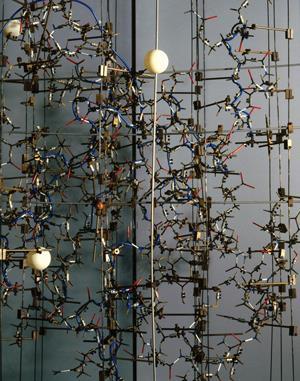
After centuries of chemists unwittingly producing art, the hidden aesthetic power within visual representation of chemistry is slowly being unlocked. Peter Morris, keeper of research projects and a senior research fellow at the Science Museum in London, UK, highlights two crystallographic models by Dorothy Hodgkin that he would class as art: insulin and vitamin B12. ‘They both show the way that x-ray crystallographers build models involves aesthetic as well as scientific data. Another reason I consider them to be artistic is that they have all been featured in artistic contexts.’ The insulin model was lent to the National Portrait Gallery for several years so it could be displayed near a portrait of Hodgkin. The B12 model was displayed in the British pavilion at the 1958 World Fair in Brussels and it appeared in a postage stamp featuring the crystallographer in 1996.
Morris was also involved in a 2008 Wellcome Collection exhibition that explored the creations of the Festival of Britain Pattern Group. This was a collaboration between x-ray crystallographers and designers for the 1951 Festival of Britain. The vision for the group came in 1937, when x-ray crystallographer Helen Megaw presented Hodgkin with a linen cushion onto which she had embroidered the pattern of the crystal structure of aluminium hydroxide in silver, red and blue thread. Megaw’s wedding gift to her friend inspired, amongst other things, a Lawrence Bragg diagram of the mineral beryl to be embroidered onto lace and one of Hodgkin’s insulin drawings to become a wallpaper pattern, for the festival
‘I have always found crystal structures to be fascinating,’ says nanoscientist Ljiljana Fruk of Karlsruhe Institute of Technology in Germany. ‘Some crystal structures are so beautiful in their symmetry that they remind me of Arabic art and how geometry has always been used as a decoration.’
Fruk has had a long-running fascinated with water and the representation of ice structures. ‘The other thing is the message behind the structures. This is because it is symmetric, it looks beautiful, but I think the message behind this ice structure means is has more impact on us, because if you think about the symmetrical holes, it is these holes that make ice lighter than water and this property made life possible on earth,’ she says. ‘So if you look at the chemistry in some aesthetically beautiful structures, it is also important to look at the meaning behind it.’
A whole new world
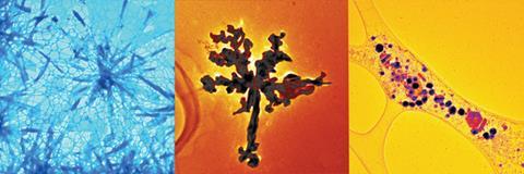
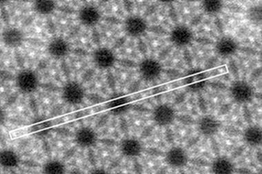
New imaging techniques are revealing pictures we could only imagine before. ‘There is this whole new world which is opening as we get closer to imaging atoms. I was really impressed by the nanoparticle images where you can really distinguish atoms and I consider this to be amazingly beautiful,’ says Fruk. And now that chemists can really see what they’re doing, they’re expressing their artistic side on the nanoscale and sharing them with the public.
Every year for the past four years, Fruk and colleagues have made a ‘nanoart’ calendar, which they sell to raise money for charity. The most recent calendar contained transmission electron microscopy pictures to show what can be seen in the nanoworld. Her group have also made a poster that they have named NanoWarhol. This fits with Fruk’s concept of art: ‘Something that is aesthetically appealing but that is also enhanced by people who actually work with it.
‘Art always has something to do with the aesthetic appeal,’ she reiterates. ‘It’s about the combination of beauty, message and emotional power. I am always impressed by the human use of skill and imagination to represent what is really very abstract – molecules are abstract, we have only developed the way to represent them.’
So are understanding and emotion intimately linked when considering aesthetics? Robert Root-Bernstein, professor of physiology at Michigan State University in the US certainly thinks so. ‘Beyond the experiential aspects of aesthetics, most philosophers and practitioners argue that a complete aesthetic experience must combine sensation, craft and understanding. The best science, like the best art, is that which appeals to the widest range of emotion and intellect.’
Root-Bernstein says that scientists are often frustrated when yielding insights that are not immediately amenable to translation into words and pictures. But at the end of the day, communicating science will always benefit from imagination and aesthetic sense, and just like art, contemplation drives the unearthing of new insights.
Periodic art
Many artists have been inspired by the periodic table. ‘I’m attracted by images that categorise,’ says Spector, ‘I think this is, in part, why contemporary artists are compelled by the periodic table as a scaffold for artistic expression.’ Canadian David Clark from the Nova Scotia College of Art and Design is one such artist who transforms the periodic table. ‘He subverts the familiar image of the periodic table by using its recognisable form as a reminder that the shape of the periodic table, even without the information it usually holds, has become iconic. They’re very charming,’ says Spector.
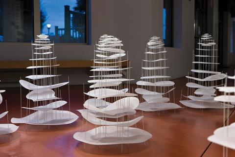
Another is sculptor Rebecca Kamen, based near Washington DC, US. Her Elemental garden is filled with sculptures of the elements made out of mylar and fiberglass rods. They look very abstract but the number of holes and rods in each sculpture represents the atomic number of the element. Each of the elements starting with hydrogen gets larger in scale and elevation and more complex as it moves out into the space, reflecting the increase in atomic number.
Originality is an important element for people’s willingness to classify such pieces as art. ‘A lot of people who do stuff with the periodic table just take it and turn it into an artistic image, and that can be very affecting, but she [Kamen] does something different with it. I like that aspect of it, the way she takes the periodic table and transforms it so it’s no longer the periodic table but it is,’ says Spector.
Read more from our chemistry and art theme issue


No comments yet