2014–15 competition winner Paul Brack reports on AkzoNobel’s colourful collaborations with the Van Gogh Museum
Like other painters of his era, Vincent van Gogh was all too aware that the colours in his work were transient. ‘Paintings fade like flowers,’ he wrote in a letter to his brother, the art dealer Theo. In another, he comments that because his colours are unstable ‘there is all the more reason to simply use them too brightly – time will tone them down only too much’. Now, 125 years after his death, conservators at the Van Gogh Museum in Amsterdam in the Netherlands are working with scientists at AkzoNobel to reverse the effects of time, and reveal Van Gogh’s paintings as they appeared when he first painted them.
Light and shade
In Sassenheim, a small town about 20 miles south of Amsterdam, thousands of brightly painted surfaces, from panels of wood to car doors, sit out in the sun. The beautiful array of colours looks like an art installation, but it is in fact AkzoNobel’s outdoor environmental testing area, where the durability of new products is assessed.
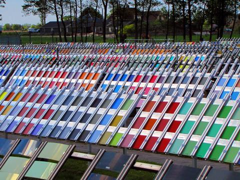
This testing area is a vital part of Peter Rotteveel’s work. He leads the colour infrastructure and processes team, and his role is to make sure that when a customer buys a product, they get exactly the colour they expect. This can be tricky, Rotteveel explains, because colour is dynamic, depending on the lighting conditions; the colour of a paint inside a house under thermoluminescent lighting is not the same as it would be outside in the sun. And customers can tell the difference: the human eye can distinguish up to a scarcely believable 3 million different colours.
To solve this problem, Rotteveel turns to spectroscopy. Every colour in AkzoNobel’s palette has a standard, and for every standard, a visible-region reflectance spectrum is held in the company’s database of 250,000 colours. The colour of any product can thus be checked by recording its reflectance spectrum and comparing it to the standards in the database. A visual check is always made too, under controlled lighting conditions. This ensures that the colour the customer picks out for their bedroom on a fan deck is the one they get in the tin of paint they buy.
But lighting is just one of the variables to consider. For example, different surfaces (wood, plaster, brick) require different types of paints, and the different components of these paints will also affect the colour: emulsion paints use water as a solvent, with acrylic polymers as the binder, while gloss paints use white spirit as the solvent, with alkyd polymers (derived from alcohols and organic acids) as the binder. So if I wanted to paint my entire house with ‘Jasmine shimmer’, inside and out, I’d need several different paints, each with differing formulations (and possibly different pigments, depending on their compatibility with other elements of the paint).
Historically, creating the recipes for each of these paints would have been a rather time-consuming job for a colour scientist, who would have worked them out by an iterative process. However, in recent years, computational tools have enabled paint makers to create bespoke recipes, giving people the exact shade of paint they want at the push of a button.
Any colour you like
The reflectance spectrum of a paint can be predicted if the amount of light absorbed (K) and scattered (S) by its components at different wavelengths is known. The first stage is to create a database of K and S values for paint ingredients, which can be obtained by measuring the reflectance (R) of each separate ingredient mixed with a white standard (for which SS ~ 1, and KS ~ 0) and then using the Kubelka–Munk equation to extract the K and S values for that component (Kp and Sp):

Where C is the proportion by mass. The spectrum of any mixture of those components can then be predicted using Duncan’s rule, which states that the sum of concentration multiplied by K and its concentration multiplied by S for every component at a given wavelength will give the reflectance value at that particular wavelength. Repeating this process for every visible-light wavelength generates a predicted reflectance spectrum, and using this the paint’s expected colour can be deduced. One problem with this method is that the Kubelka–Munk theory assumes ideal mixing of the paint ingredients, but pigments often float to the top, or flocculation occurs, and so the predicted reflectance spectra do not match perfectly with the experimentally obtained spectra. Thus the recipes have to be tweaked to try to get as close a match as possible to the desired colour (or at least close enough that our eyes can’t tell).
Fading from view
As Margot Vlot, a colour scientist at AkzoNobel, explains, using Kubelka–Munk theory (see box) and the spectral database, it’s possible to predict the reflectance spectrum, and thus the colour, of a paint that would be produced by a particular recipe.
But the reverse is also possible: colour matching software can start with a reflectance spectrum and suggest the ingredients that would produce a paint to match. If you have a scratch on your car, for example, this will ensure that the new paint looks exactly like the old coat.
In 2014, AkzoNobel used the same process to create a colour palette inspired by the works of Vincent van Gogh. Willeke Jongejan, a senior global colour designer at Akzo Nobel, and her team developed the range by selecting colours they felt most reflected the colours used by Van Gogh from the many provided by the scientists. The result is a range of 10 colours from ‘Sunflower yellow’ to ‘Iris blue’.
But as Van Gogh himself noted (and indeed, it would appear, intended), the colours we see today are not necessarily the same ones that he saw, which presents an altogether more complicated and exciting challenge: to visualise a Van Gogh painting as it was when he first painted it.
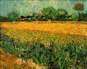
For example, ‘Iris blue’ was inspired by Field with irises, painted in 1888 in Arles, France. This painting was recently returned to display in the Van Gogh Museum in Amsterdam after a painstaking restoration job led by chief conservator Ella Hendriks, which took 18 months to remove a yellowing varnish.
In the painting’s bucolic scene, the title flowers form the foreground – blue borders around the fields and trees. But in letters documenting his trip to Arles, Van Gogh describes violet flowers, not blue. And he writes of red poppies and yellow buttercups, neither of which can be found in the painting today. This has led experts to suspect that the painting’s pigments may have degraded.
Researchers have been investigating Van Gogh’s vanishing yellows and reds for a decade. Recent work by scientists at Shell on Van Gogh’s The bedroom revealed that the painting’s blue walls may originally have been purple. In this case, the colour change is the result of degradation of the ‘red lakes’ pigments. These pigments are a mixture of xanthene dyes such as eosin and erythrosine. Though initially giving a bright red colour, over time eosin and erythrosine photodegrade, and worse still, Van Gogh painted them onto a base layer of aluminium hydroxide, which catalyses the process. A digital visualisation of The bedroom as it would have looked the day Van Gogh finished it can now be viewed at the Van Gogh Museum.
AkzoNobel and their collaborators want to do the same for Field with irises. As Eric Kirchner, an AkzoNobel colour scientist who is part of the project, explains, the first task was to acquire a reflectance spectrum for every single pixel of the painting, a total of 1.7 million pixels. They are now matching each of these spectra to the AkzoNobel database, to work out which pigment is in each pixel. This is likely to be difficult: the original pigments may not even exist in the database, and so potential candidates will have to be deduced by historians and conservationists based on the likely pigments available to Van Gogh at the time. To help with this, they are using chemical clues from x-ray fluorescence analysis conducted on the painting, which reveals the elemental composition of each individual pixel.

The prospective paint mixtures will then be made by AkzoNobel chemists to see if they match, and then further work will be required to establish whether these are the original pigments from the 1880s or degradation products, and if the latter, from what they degraded. Eric and his colleagues are hopeful that this method will eventually return the painting’s lost poppies and buttercups.
It is remarkable that a technology developed for the seemingly mundane task of enabling people to paint their homes and cars in whatever colour they choose is now being used to unlock the secrets of one of the most famous paintings in the world.
Perhaps the next time you walk past that apparently innocuous paint tinting machine at your local DIY store, you’ll appreciate the artistry involved.
Paul Brack is a PhD student at Loughborough University and is the winner of the 2014–15 science communication competition


No comments yet