

Data visualisation has come a long way as a tool for scientific communication, but in its next phase it will be the interface that enables chemists to collaborate with AI.
Sometimes a graph is all you need. Turning data into visual representations is one of the key tools of scientific progress – rendering information in a way that makes it easy for humans to interpret the data, and to use it to predict or to persuade. As the Scottish engineer and economist William Playfair put it: ‘making an appeal to the eye … is the best and readiest method of conveying a distinct idea.’
Graphical representations are now an essential part of science communication and we have developed standards here that serve us well. But these standards need to be updated for the increasingly digital world we live in. And with ever growing volumes of data – and increasingly sophisticated machine learning and AI – visualisation is also taking on new relevance. In the future, visualisations will not only be a means of working with each other, they will enable us to stay in the analytic loop as we work alongside machines.
Charting the history of datavis
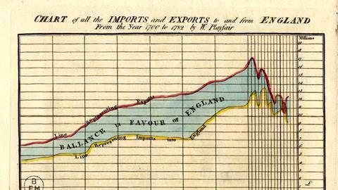
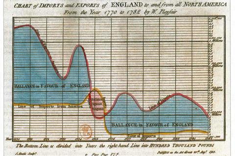
Today, a data visualisation like the bar chart is so elementary that it’s hard to imagine it didn’t exist before Playfair invented it in 1786. He also gave us line and area charts (and, unfortunately, the pie chart). Playfair used these statistical graphics to turn dry data into persuasive arguments, in his case, for economic policy around balance of trade. Visualisations have an impressive record in accelerating the impact of scientific understanding, such as Florence Nightingale’s diagrams that led to improved hospital sanitation, or the physician John Snow’s famous graphic identifying the Broad Street water pump as the epicentre of a cholera outbreak in London.
Chemistry in particular has a rich tradition of visualising information. The periodic table is perhaps one of the earliest scientific infographics, and certainly one of the most impactful. Like all infographics, you can make the case for better representations, but the original has proven its value in educating and inspiring generations of chemists. In fact, it’s easy to forget its primary role was as a research tool - predicting new elements and giving hints of the structures underlying the arrangement that were yet to be discovered.
Interactive data visualisations empower our curiosity by allowing us to formulate new queries
Pictures have a unique ability to feed our curiosity, to convey and convince. I remember working with colleagues to develop a liquid formulation of a polymer with solvent and water, which involved preparing samples in different proportions and rating them for stability. When I created a ternary plot of the experiments and coloured the dots from red to green, the stable region popped out as a cluster of emerald, showing the workable limits for each ingredient. I then went on at length about how we could model the boundaries with neural nets and polynomial regressions, but I’d missed my own point. ‘Stop, Phil!’ my colleagues insisted: ‘The picture is enough!’
Visualising the future
We now have access to a rich array of visualisations, and digital tools mean we are no longer constrained to static plots on paper. Interactive graphics are the standard in business intelligence, and they should also be the standard in academic intelligence. Interactive visualisations bring another dimension to how we work with data because they not only provide insight, they empower our curiosity by allowing us to formulate new queries and uncover new insights. By building different views of a dataset we can ask different questions of the data, with each answer leading to new questions and hypotheses. Humans can quickly become skilled at using interactive, point-and-click software as a near-immediate enabler of this exploration process, where coding solutions or even natural language prompts instead take us out of the flow.
These skills and tools will also be essential to avoid a future where we simply become drones that passively check the output of ‘lights out’ autonomous labs. Machines don’t need data visualisations to interpret data – one of their great strengths is the ability to work directly with vast volumes of data. Yet charts, plots and graphs will still be an essential tool for us because they act as an interpretation layer – an interface between humans and machines that enables us to work alongside them and check against hallucinations. Even more than that, human-in-the-loop approaches to AI and automation only make sense if there is value in us retaining agency in guiding the science. Data visualisation empowers us to collaborate in the best possible human–machine partnership.
JMP and Chemistry World are holding a live, interactive two-part workshop that will explore how modern data visualisation and data analysis support rigorous, insight-driven science. Join us on 28 and 29 April.
Visualising data webinar
As scientific data becomes increasingly complex, the ability to interpret and communicate findings clearly is essential. This workshop provides structured, practical training in visual analytics, equipping participants with tools to uncover structure, evaluate relationships, and support defensible conclusions. Join us to learn about modern data visualisation and exploratory data analysis techniques.
Complete both workshop modules to earn a certificate from the Royal Society of Chemistry. Find out more or register now for the webinars using the inks below.
Day 1: Foundations of visual analytics
What is the foundation of working with visual analytics? Using example case studies, you'll discover how scientists and engineers can benefit.
Show moreDay 2: Exploring high-dimensional data
In the second session, you'll gain a deeper understanding of how to integrate your own data with the tools, and discover more advanced problem-solving techniques that will enable you to hit the ground running with your own visualisations.
Show more


No comments yet